Top CSS Frameworks for React: Build Stunning UIs in 2025
2025-02-18 14:00:05

When building modern web applications with React, choosing the right CSS framework can make all the difference. Whether you’re a Frontend Developer, UI/UX Designer, or Mobile App Developer, the way you style your React components can significantly impact the user experience, performance, and maintainability of your project. With so many CSS frameworks for React available, it can be challenging to decide which one best fits your needs.
In this guide, we’ll explore some of the best CSS frameworks for React, from popular libraries like Material UI and Bootstrap to utility-first solutions like Tailwind CSS. Each framework offers unique features, such as pre-built components, responsive design capabilities, and seamless integration with React. Whether you’re looking for a React UI framework to speed up development or a CSS-in-JS library for more flexibility, this list has something for everyone.
By the end of this article, you’ll have a clear understanding of the top CSS frameworks for React and how they can help you create stunning, responsive, and user-friendly interfaces. Let’s dive in!
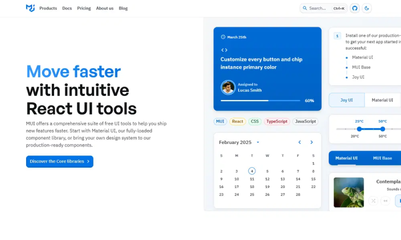
Material UI
Material UI is one of the most popular React CSS frameworks, offering a rich set of pre-built components that follow Google’s Material Design guidelines. It’s perfect for developers who want to create visually appealing and responsive UIs with minimal effort. With features like theming, customizable components, and excellent documentation, Material UI is a go-to choice for React developers. Its seamless integration with React and support for CSS-in-JS make it a powerful tool for building modern web applications.
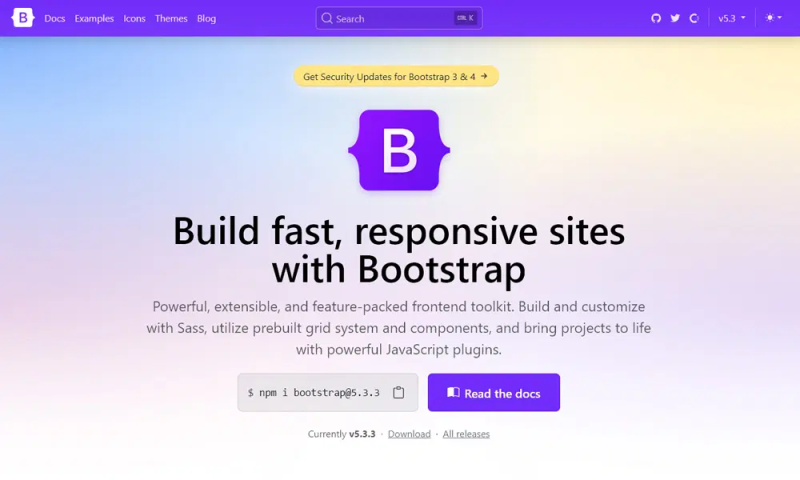
Bootstrap
Bootstrap is a well-known CSS framework that has been widely adopted in the web development community. With its React-specific version, React-Bootstrap, developers can easily create responsive and mobile-first designs. Bootstrap offers a grid system, pre-styled components, and extensive customization options, making it a great choice for React developers who want to build consistent and professional-looking interfaces quickly.
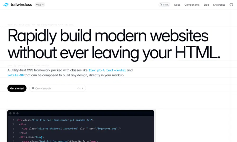
Tailwind CSS
Tailwind CSS is a utility-first CSS framework that allows developers to build custom designs directly in their React components. Unlike traditional frameworks, Tailwind doesn’t come with pre-designed components. Instead, it provides low-level utility classes that can be combined to create unique designs. This approach offers unparalleled flexibility, making Tailwind CSS a favorite among React developers who prefer a more hands-on approach to styling.
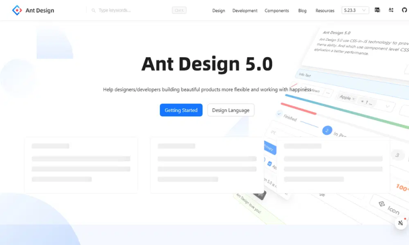
Ant Design
Ant Design is a comprehensive React UI framework that provides a wide range of high-quality components and design patterns. It’s particularly popular for enterprise-level applications due to its focus on consistency and usability. With features like internationalization, theming, and a robust set of components, Ant Design is an excellent choice for React developers building complex and scalable applications.
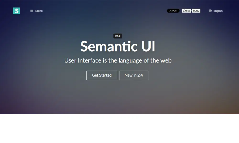
Semantic UI
Semantic UI is a CSS framework that emphasizes human-friendly HTML and intuitive class names. Its React integration, Semantic UI React, allows developers to build responsive and accessible UIs with ease. The framework’s focus on simplicity and readability makes it a great option for React developers who want to create clean and maintainable code.
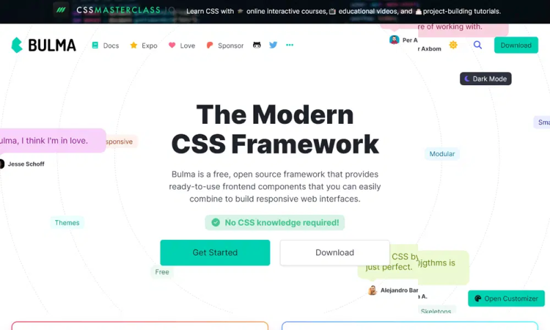
Bulma
Bulma is a modern CSS framework based on Flexbox, offering a simple and elegant way to create responsive layouts. It’s lightweight and easy to use, making it a great choice for React developers who want to avoid the complexity of larger frameworks. Bulma’s modular structure allows developers to import only the components they need, resulting in faster load times and cleaner code.
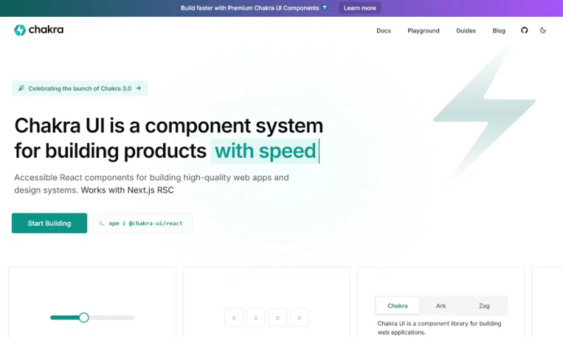
Chakra UI
Chakra UI is a React component library that focuses on accessibility and simplicity. It provides a set of customizable and composable components, making it easy to build accessible and responsive UIs. With features like dark mode support, theming, and a strong focus on developer experience, Chakra UI is a great choice for React developers who prioritize accessibility and ease of use.
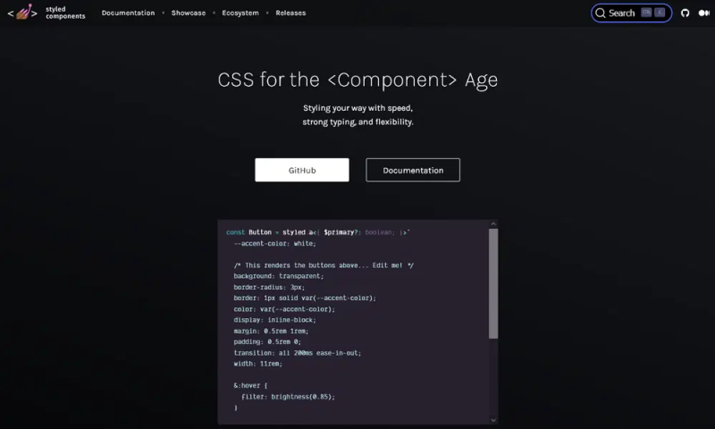
Styled Components
Styled Components is a CSS-in-JS library that allows developers to write CSS directly within their React components. This approach enables scoped styles, dynamic styling, and better component encapsulation. For React developers who want to keep their styles tightly coupled with their components, Styled Components offers a powerful and flexible solution.
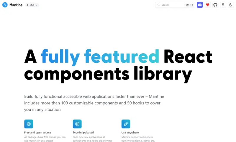
Mantine
Mantine is a modern React UI library that provides a rich set of customizable components and hooks. It’s designed to be easy to use while offering advanced features like theming, dark mode, and responsive design. Mantine’s focus on developer productivity and flexibility makes it a strong contender for React developers looking for a comprehensive styling solution.
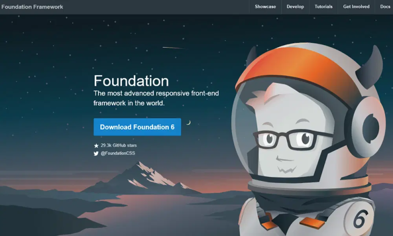
Foundation
Foundation is a responsive CSS framework that offers a flexible grid system and a wide range of UI components. Its React version, Foundation for Sites, allows developers to build responsive and mobile-first designs with ease. Foundation’s modular approach and extensive customization options make it a great choice for React developers who need a robust and flexible framework.
Rebass
Rebass is a minimal React UI library built on Styled System. It provides a set of primitive components that can be easily customized and extended. Rebass is ideal for React developers who prefer a lightweight and flexible solution for building UIs. Its focus on simplicity and performance makes it a great choice for projects where speed and efficiency are critical.

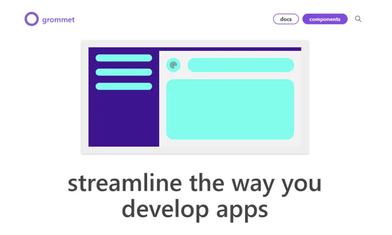
Grommet
Grommet is a React UI framework that focuses on accessibility, responsiveness, and theming. It provides a rich set of components and tools for building modern web applications. Grommet’s emphasis on accessibility and responsive design makes it a great choice for React developers building applications that need to work across a wide range of devices and screen sizes.
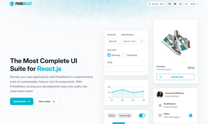
PrimeReact
PrimeReact is a comprehensive React UI library that offers a wide range of pre-built components and templates. It’s designed for developers who want to build enterprise-level applications quickly and efficiently. With features like theming, responsive design, and extensive documentation, PrimeReact is a powerful tool for React developers looking to streamline their workflow.
React Suite
React Suite is a React UI library that provides a set of components for building enterprise-level applications. It’s designed with a focus on simplicity and usability, making it a great choice for React developers who need a reliable and easy-to-use framework. React Suite’s extensive documentation and active community make it a solid option for developers of all skill levels.
Evergreen
Evergreen is a React UI framework that provides a set of flexible and composable components. It’s designed to be easy to use while offering advanced features like theming and responsive design. Evergreen’s focus on simplicity and developer experience makes it a great choice for React developers who want to build modern and scalable applications.
